Pages

Friday, May 27, 2016

Pushing Through It to Get to It--Goldfinches

In early April, I decided to work at my feeders when the goldfinches came in flock. I had an interesting experience.
It started with my not able to get anything down that resembled a bird--at least, that's how it felt to me. Warming up, measuring, trying to get proportions. I felt like suddenly I was reading a foreign language! I even wondered (I think I wrote it on one of the pages) if working from taxidermy and slow-moving housemates was dulling my ability to see quickly moving subjects. It was kind of an unpleasant feeling. Probably a lot of IC kicking in there.


BUT, I told myself I would not quit and that I would practice.
I allowed myself one "crutch" to kick myself out of it (you'll see it on the pages above, marked)--I took a few photos and using them camera display, with the birds still in front of me at the feeder, I took a few minutes to do a study of a head and a foot to try to ground myself, to get my hand and my head to connect again...
and while I have been carefully avoiding drawing from photos, this did work. Somehow, it jump started what wasn't syncing in my first drawings and when I went back to drawing from the live birds, I could catch them quickly and fairly accurately. 


In the end I drew the two-page spread from the live birds (kind of made up a generalized wing pattern)... then later experimented with new Stabilo Woody pencils for coloring.


It was a GREAT drawing session not because of the pages but because of the notion that one can have bad days (or, at least, a bad 20 minutes) of drawing and if you keep with it, you can kick yourself out of it. I wound up happy with the whole experience, pleased with the work, and with pages that will remind me of perseverance and practice as much as of goldfinches.
I followed up the next week by talking about the creative process with my writing students!  So much of creative making--no matter what the medium, the art, the goal--follows the same ups and downs!

Thursday, May 26, 2016

Scribbling with Watercolors


I really want to learn more about watercolors and how they work. 

And while that means I read and look for classes, it also means I simply have to play around with them! 

Scribbling with paint!  Asking, "What happens if I do this?"  "Or this?"

"Breaking" a few sketches, as Roz Stendahl advises.  Sometimes you just gotta do it to figure out how far you can push something.

So for a while I just messed around, doing my daily sketches and adding wonky colors to see what would happen.  


And sometimes I put the colors down first and then scribbled on top of them--sometimes completely unrelated things!


What the heck, right?  I'm learning!

Scribbling doesn't mean without purpose.  Or without standards.  Or without mindfulness or value.  

Scribbling means loose and playful and exploratory and creative.

Scribbling with paint is all those things!

Wednesday, May 25, 2016

Triceratops in Rose

Lately I've continued to play around with watercolors.

I'm trying to learn how to layer colors to achieve different effects.  In particular, I continue to learn how to build volume.

Plus, I just like to noodle around with my supplies.

So for this effort, I took a pretty large sketchbook and gessoed one page.  You'll see the grainy texture from the gesso in the photos below.

Then I applied a thin wash of Winsor and Newton rose to the background.

Next, I sketched my model triceratops in pencil (to make sure I fit the whole thing on the page).  Then I put in thin pen lines.

Next I began to add watercolor.  Rose and teal.  I built up layers for a while.  I know I added a warmer red in there a cool blue for the shadows, but I don't remember what.  Then I wanted to put back some highlights, so I went in on the face with a Posca paint pen.


While I was liking what I was getting, I didn't feel like these were the colors which should dominate the entire drawing.  So I stepped back, thought about it, and then went for it with darker blue and violet in the shadow areas, and more yellow and orange in the lighter spots.  I did a light wash with green over the whole thing. 

And finally, I returned to restate the contour ink lines, but this time with a dip pen.


I very much like the results!

I regret that I got so involved in the flow of scribbling with the paints that I didn't keep better track of what I used.

I know that I made at least ten passes as I layered this.

While I liked the visual "noise" of the gessoed surface a lot, I wonder if it could damage my brush?  I'm not sure I'd return to this surface unless I took more care to use a cheap brush!


Tuesday, May 24, 2016

Sketching at Tulip Time

During May 4-14, I committed myself to going into nearby Holland, Michigan at least five times during "Tulip Time."  Braving the traffic alone required mustering up my courage, but I really wanted to visit a crowded, multi-day event, and do some sketching of live subjects in public.

I had fun alternating between people and flowers and trees and buildings.

And I had fun switching up art tools!  I found myself gravitating toward my Pelikan M200 fountain pen and a set of Schminke pan watercolors most of the time.


I discovered I really liked returning several times in the course of ten days to the same places.

Some things stayed the same--the tulips, which, you'll notice, I didn't draw that much (and I thought I would).  Also, the police officers on Segways.  I watched those for a while before I attempted to sketch one!  That was fun.

Some things changed every day--notably the weather.  One day I sketched in windy pouring rain (thus, the drips on my sketch).  One day I sat on an outdoor patio in the warm sun and sketched.

And I liked being "a tourist" in my own town (or at least, a nearby town).  Going in with eyes open to the new and unusual helped me see things (like that clock tower) that I pass by every day, several times a day, but never thought to draw.


Monday, May 23, 2016

Early Spring Gouache Experiments

On an icy, sleety day in mid April, I decided to experiment with some gouache. I've had it and used dabs here and there, but never really asked "what does this do" and tried a whole sketch with it.

And even though I greatly value reading and watching demos, I am learning that when it comes to making stuff, I have to get in and scribble--really play with abandon and probably make a mess--to understand how things work.

So I decided to try something dark with light values and just play around to see how it layered and how opaque the lights were and all of that.

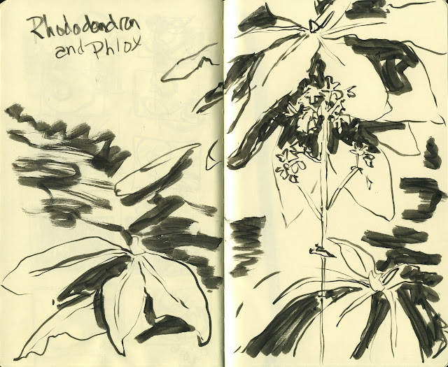
I started with a decision to do my spring rhododendrons in my back yard. It has been freezing (literally freezing rain yesterday), so the buds are still closed tight. The bushes are at the edge of the woods, so the background is dark. And nearby is a perennial garden with phlox and daisies... all dormant now but I noticed one loan phlox dried and still standing--ghostly-- nearby. Anyhow, that caught my eye as a very white value against all the dark greens.

First I made two pages of value thumbnail sketches. What did it look like? What did I want it to look like? You might be able to see, from the scratches that are my thumbnails, that I perceived a spiral design in it, and so messed around with what that might look like. At one point, I even turned the journal upside down and drew the thumbnails upside down, just to test-drive the image... I have a whole new appreciation for why/how thumbnails are useful.


Then I did a two-page spread, a bit more detail, to capture the structure of the rhode leaves and the placement of the phlox...


Next, I decided to work outside of my sketchbook on some quality wc paper, again, just as part of the overall gouache experience for me. I painted an underlayer in thinned acrylic in complementary colors (I knew the painting would be dark and green, mostly). I was thinking a little about the thumbnails and the movements I thought would happen as I put down the magenta and a little yellow.


After that dried, I put on a dark layer. What I wanted to experience was how light gouache worked over dark, so I started with the dark and built "up" toward the lighter values. After that dried I started building the actual forms of the rhodes.


Anyhow, roughly one million layers later, I called it quits.


I took a photo of the image and put it in my computer and messed with the contrast a little. That was how I was able to learn/see what I wanted the result to look like... not the level of contrast I achieved with the paint. I might go back and mess with it more later.


I learned a TON about gouache--mixing and watering down. How the layers can (or how to avoid) activating the layer beneath. Opacity. Light over dark. It is still too dark, I think, but really my goal wasn't a great or finished "painting." Though actually, I kind of like the result. The goal was to play with the process from "look at that cool bush" through prelims, sketches, and paint and just see what I could experience and learn. It was such an enjoyable experience on an icy day!


Friday, May 20, 2016

More Watercolor Scribbling--In a Portrait

Could be, I said to myself, that if I paint this sketch with unrealistic teal and thoindigo violet and yellow, I will ruin the portrait.

Could be it will come out looking cool.

Regardless, I am sure I'll learn something about tone and volume and how these paints work on this paper.

So I did it.


That was some excellent fun.

What can you do that is both real and not real in your sketchbook today?
Scribble away!


Thursday, May 19, 2016

More People Scribbles from the Public Library

Every so often I feel like I really need to practice capturing people quickly.

So I head out into public with the idea that I will try to scribble some marks based on people I observe, spending no more than two minutes on each person.  Less would even be better.

I am not trying to produce likenesses.  I'm trying to produce variety and essence of people and posture.

I have found that the public library is a great place to do this, because all kinds of people go there!  All ages, sizes, styles of clothing.  I haven't found a better place to get the variety of people.

I'll share my discovery from this day of public sketching:  sitting within sight of the copy machines really pays off!  People come and stand by the copy machines for several minutes at a time.  And often, they get frustrated.  So as an artist you get a wonderful display of different body  language and emotions!


On this day I spent about 90 minutes sketching these four page spread, and another half hour or so adding some color here and there.

Terrific practice in observing and attempting to get down on paper what I observed!


Wednesday, May 18, 2016

Creating a Scene in a Waiting Room

A few weeks ago I accompanied someone having outpatient surgery.

So I had a few hours to kill in the waiting room.

Normally, I fill a page (or more) with a collage of faces and bodies sitting in chairs.

But this time, mindful that one of my goals is to sketch scenes--people (or animals or objects) in a larger context--I tried to do just that.

Here is the sketch in progress with a peek at the real view.


You can see that I focused and simplified quite a bit.

Here's a better look at the final sketch.


Not sure if I should add color or not!

I used my Pentel Pocket Brush pen (a true favorite) and I was working on Bee SuperDeluxe paper.   I like it for many things, but it does not hold up well if you put watercolor down and then want to lift it.  So I'm reluctant to paint on any more sketches which I put on this paper.

The time flew and I got good practice in.  I'm quite please with the couple on the left.


Tuesday, May 17, 2016

Blue Dinosaur in a New Blue Sketchbook

I made a new sketchbook the other day.

I buy some of my favorite paper in large rolls, then cut it to the size I want and bind by hand.  Then I get the paper I want in the size I want.

This new one resulted from an experiment:  I wanted to see if I could bind one that would fold back on itself, and had a soft cover.

I bound the paper with coptic binding and covered it in a thick handmade paper I got at the local Fair Trade store.  So far so good.


I used Bee Paper's Super Deluxe sketchpaper, because I had the end of a roll left from some time ago.

I didn't worry too much about getting everything exact on this sketchbook--I plan to carry it lots of places and beat it up.  So I had a good time tossing it together and now I'll enjoy it.

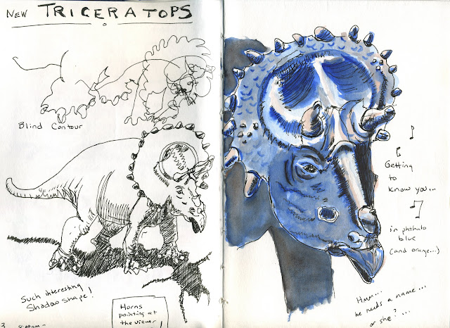
Anyhow, after scribbling in my contact and current palette information on the first page (which I do to start any new sketchbook--it gets me past the "new book" syndrome), I decided to practice my scribbling on a dinosaur!  A triceratops to be exact.


In phthalo blue and cadmium red orange.

This is the first time I've drawn this particular toy, so I viewed this scribbling session as a "getting to know you" time.  I even sang the showtune as I drew.

First, a blind contour; that's the delightful mess on the upper left.  Then a modified contour.  Then a slower scribble of just the head, but still a scribble, not attempting to catch everything, but just exploring shapes and angles and then, some values.

Let me tell you:  this only sort of looks like my dinosaur!

But I feel like I had a successful sketching session.  I got to scribble with one of my favorite fountain pens (a Pelikan M200 fine), splash paint around, study a complex and super interesting figure (boy, I sure wish I could find a time machine and go back and see a live dinosaur), and practice my scribbling skills.  What a delightful way to spend an hour!

What I want to practice next time I draw this dino again is how to capture the horns when they are pointed toward the viewer.  Foreshortening them is hard.  They kind of disappear in my painting.  So, something to work on!


Wednesday, May 11, 2016

Upside Down Bouquet

One day in March I sat down to sketch some of the flowers in our house. I put the flowers in the middle of the table, grabbed a pen and looked down... a wonderful, interesting shadow had been cast through the flowers by the overhead light.

It produced a fascinating shape of grouped upside-down flowers. So I did a contour drawing of that!

Then I did one tulip right-side up, journaled a bit, and then did close observation of colors and values as I painted.

 When I turned the finished page upside down, the conglomeration of flowers looked very interesting to me--quite like the bouquet and not really like anything I think I could have produced if I had been working right-side up the whole time.


A good reminder of how tricking the "it should look like this" part of the brain can bring good results!

Wednesday, May 4, 2016

Sunrise Swamp Times Four

A few weeks ago, before the leaves returned to the trees and in the middle of all the spring rain, I put on my tall boots and took the dogs splashing through the puddles in the woods.

Swampy spring woods produce a lot of mess, namely soaked and muddy and pollen-coated dogs.

But at sunrise, swampy spring woods also produce a lot of beauty.

Which is probably the state of most things in most of our lives, most of the time, isn't it?  A little bit messy.  A little bit beautiful.

Anyhow, I used four ATC-sized pieces of watercolor paper to nab some practice with composition, value, and hue.  So each of these tiny painting is just 2.5 by 3.5 inches.  That allows me to do them fairly quickly.  I think I did all four in less than one hour.  But unlike working in a sketchbook, I used really good paper.


The scribbling practice here for me came through messing around with how to shape the really dark portions of the scene in relationship to the really light portions.   In particular, as you can see, I was experimenting with how much of the surrounding thick woods to include.  Should I eliminate the many many trees, but make just one tree larger?  That sort of thing.  Plus, I worked with several different triads of color, just to practice.

The first one is most "realistic."  The first two used the same triad of paints.

What better way to spend an hour that looking at and thinking about the dark and light of spring?