A few weeks ago, as I went to bed, I knew exactly what I wanted to work on during my art time the next morning. I wanted to work with the toy model polar bear and several brush pens and slowly explore that kind of tool and high contrast black and white work. I really like the look of that work when I admire other artists (ok, well, I admire a lot when I look at other artists). Something about the shapes of high contrast brush pen work attracts me... hmmm... perhaps the loose look of it? The abstractions which build into something?
I like when ink work (ink alone or with watercolor--it doesn't have to be black and white) suggests the form or scene, but doesn't fill with a lot of detail. I guess I like the interactivity of viewing that sort of thing. And I like the energy it seems to have. I am not sure I'm articulating this very well. I will think about it some more.
Anyhow, I tell my writing students that one of the hardest things to learn when they write is to trust the reader. That leaving gaps and taking leaps is one of the best things you can do for the energy of the story and to entice a reader to actively participate in the work, but you have to trust that when you don't write something, but only suggest it, they will get it. And you have to trust yourself to know where to put the details and what to leave out, and so on.
Okay, I bother to mention that because that is EXACTLY what I know I am not doing (yet) in my drawing and want to learn to do better. And the only way to do it is draw, assess, maybe ask others for their assessments, and do it again. I am encouraged, though, because I know it will come (at least, it does for writers!).
Anyhow, below are three pages I did in about an hour this morning, with the intention of only brush pens, only black and white, and just experimenting with contrast/value and form. What can I leave out? What must be shown? How far is too far?
I really liked the whole experience. It was relaxing, intellectually engaging, creative, fun.
I continue to really like the Pentel Aquash light black pen used in #1. Which has me rethinking my approach to watercolor. Since I like that layering, and with the Aquash I really see how it works, I have a new idea of how I might try this with watercolor. I may give that a go soon. Light washes, layered. Yes, I know that's how you are supposed to do watercolor, and I've tried. But somehow I feel like I "get" the concept more clearly now.
#2 I switched to a Kuretake 33 brush pen, one of my favorites because it is indestructible. I fill their cartridges with my own waterproof ink. It is a fat, felt tip style brush pen. Not a lot of super fine control. I really used it to play with big black shapes. I did discover that by laying it sideways and moving fast I could get a bit lighter value. Like this page a lot. Like the look of it. I think this is something I want to continue to learn.
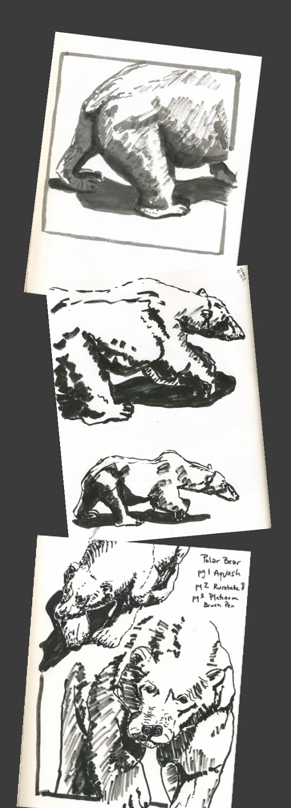
For #3 I switched to Platinum brush pen. Inexpensive, felt tip style brush pen that I like because it takes Platinum Carbon cartridges, which are waterproof and easy to carry around. Here I tried to indicate a value range through mark-making. This would be the thing I want to continue to improve on (with brush pen and also pen and ink): if I only have a pen, indicating value. Some things didn't work too well on this page, but it's okay. I'm practicing.
And I don't think I've spent this much time looking at a toy since I was a little kid. I'm getting quite fond of this polar bear!
This post comes from work I did in a class with Roz Stendahl, Drawing Practice: Drawing Live Subjects in Public. I recommend it!
No comments:
Post a Comment